Trash Fairy: Art Direction
Category: Pre-Production Artwork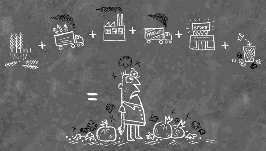
About
So after seeing the characters placed over the “chalky” colored background cards as seen in the previous section, we decided that they looked so good over the chalk that this should be style for the entire film. So the Designer developed exploratory designs based upon this chalky background feel.
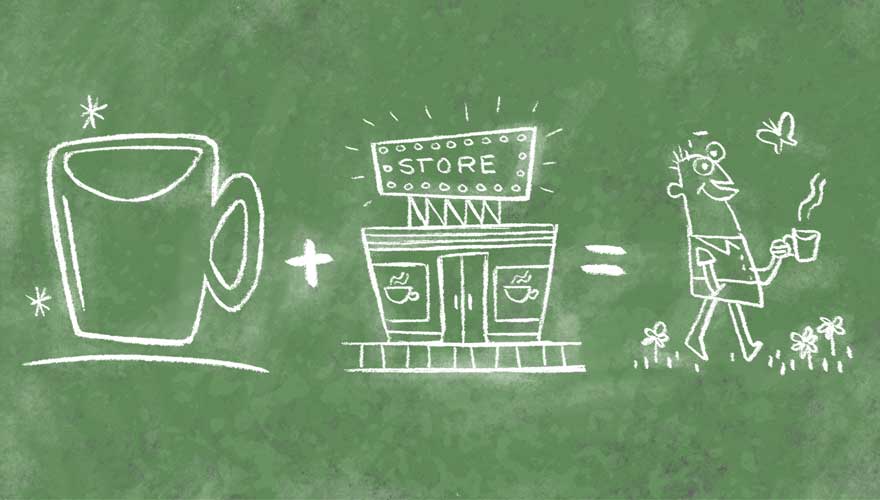
The first three designs shown here represent the parts of the story where the Fairy uses a chalkboard to illustrate his lessons. The character model of Joe takes on a “cartoon within a cartoon” look as we see Joe as interpreted, and drawn out, by the Fairy during his lessons.
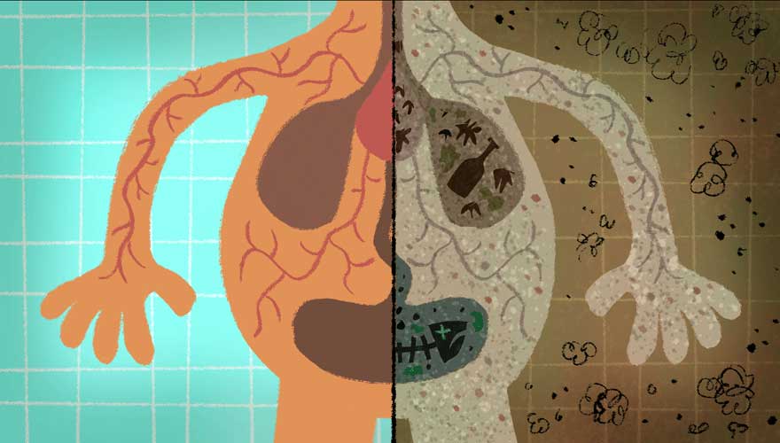
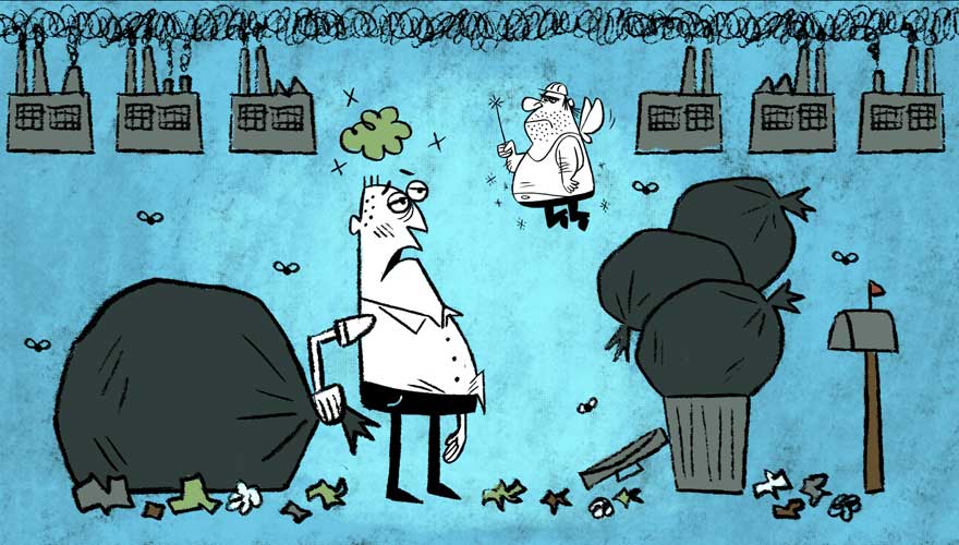
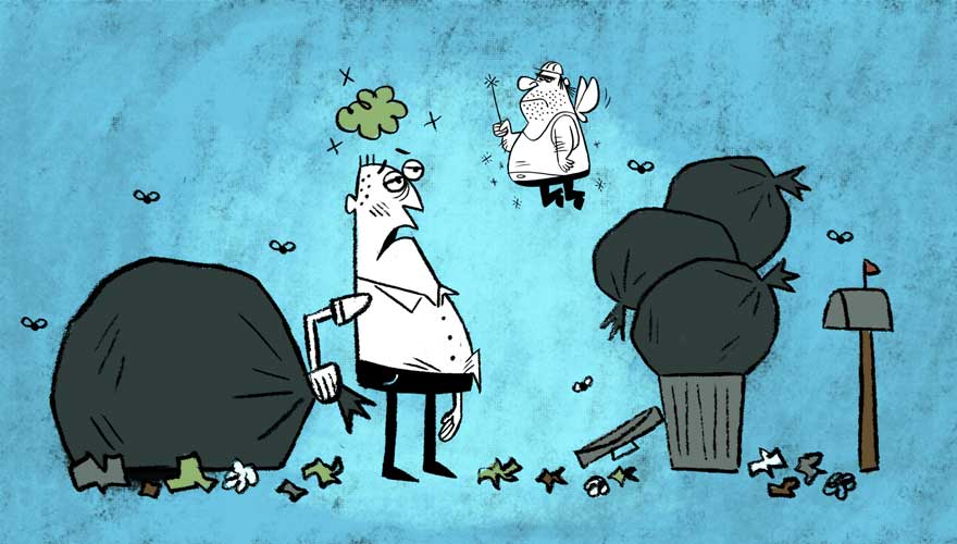
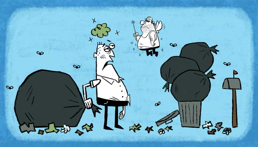
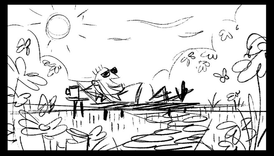
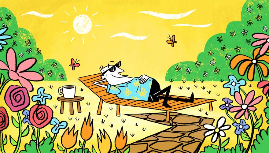
The following designs, showing Joe and the Fairy by the trash cans, and showing Joe luxuriating in a world with no trash, are exploratory designs and color concepts that will give the background artist a guide during the creation of the films backgrounds and art direction. For those of you familiar with the animation world and its famous players, the last shot of Joe on the recliner was inspired by Mary Blair’s use of foliage to create composition, and by the color styling’s of Gerald McBoing Boing. As with any exploratory artwork, it is designed to explore different concepts – to see what works and what doesn’t – and to serve as a guide for the film’s background artists and other art directors.
